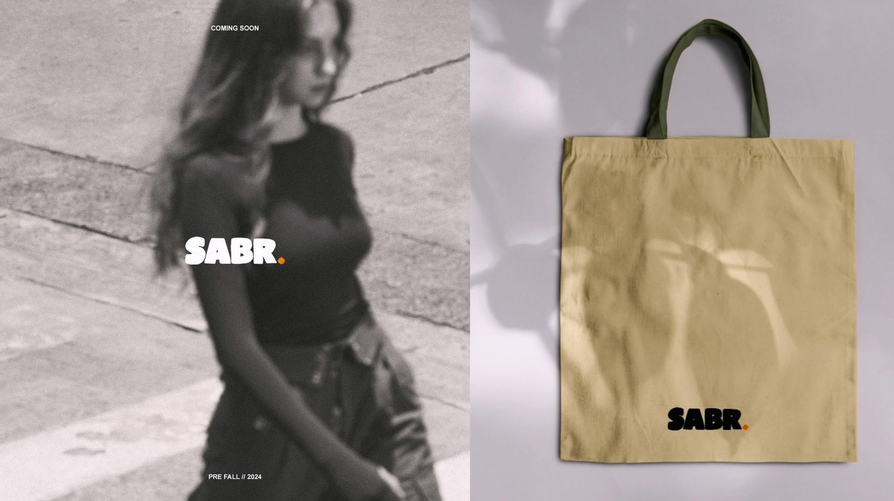
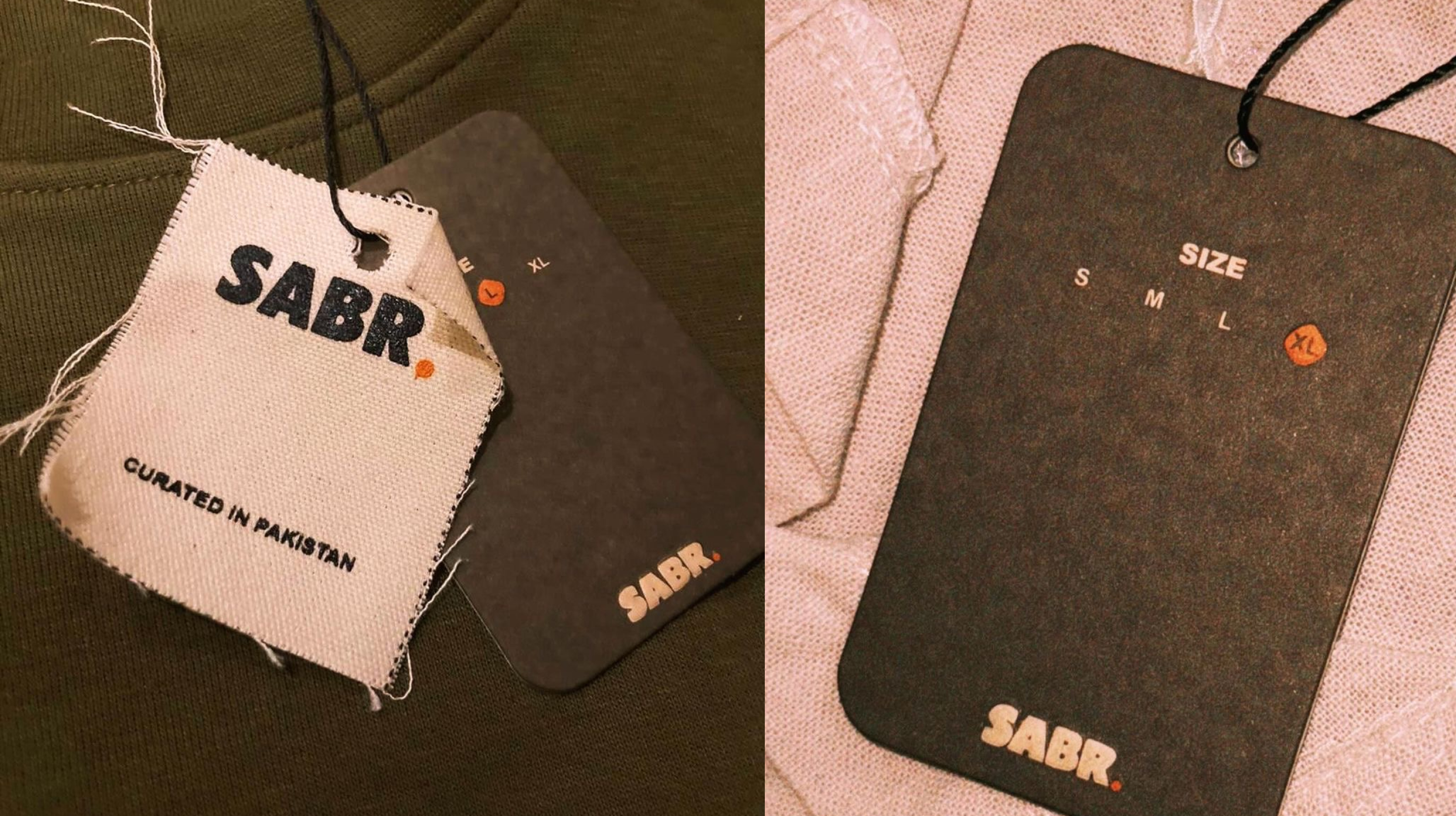
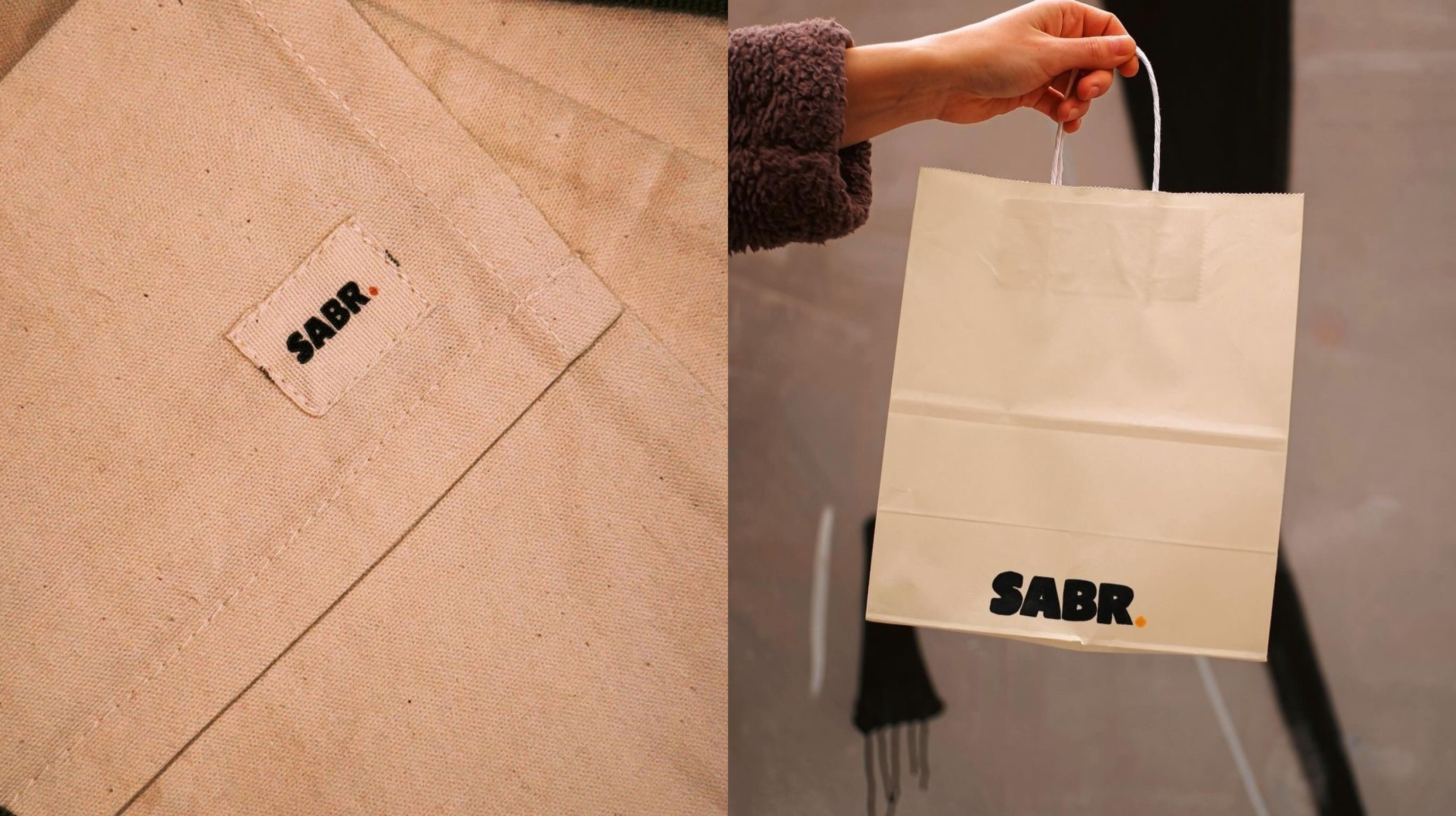
Designing a brand designed to embody peace, patience, and resilience, featuring a warm, earthy palette and organic typography that inspire mindfulness and a sense of community centered around inner calm.
Client
Boorayy
Work
Branding Kit
The client approached us with the vision of creating a brand that captures the essence of peace, patience, and resilience. Named "Sabr" — which translates to patience and resilience in both Arabic and Urdu — the brand’s identity needed to communicate a calming and grounding presence. The goal was to design a brand that wouldn’t just be visually appealing, but would also inspire a meaningful connection, inviting consumers to integrate patience and calm into their daily lives.
No items found.
To achieve this, we began by intentionally steering clear of sharp edges and cool, detached color schemes. Instead, we selected a warm, earthy palette to convey an inviting, serene feeling. This choice was complemented by typography that resembles hand-drawn watercolor strokes, with gentle curves and a natural flow. Each letter was crafted to feel organic and unrefined, as though brushed onto the page in a mindful, almost meditative state.
No items found.
The brand’s visual language was carefully constructed to evoke a sense of inner stillness, allowing it to extend beyond a traditional consumer experience. We envisioned "Sabr" becoming part of people’s daily mindsets—a subtle reminder to breathe, be patient, and embrace resilience, even in challenging moments. By fostering this connection, the brand aims to create not just a loyal consumer base, but a community united by shared values and a commitment to inner peace.